Small Site, Big Impact
Thanks to a creative and productive collaboration between Trinity and Fastspot, we launched an engaging, content-first microsite (summit.trincoll.edu) in only six weeks.
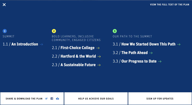
In August of 2017, Trinity College hired Fastspot to implement a tiered digital endeavor that included a refresh of the College’s visual identity system, a WordPress-driven microsite for Trinity’s Bicentennial Strategic Plan, and a redesign of TrinColl.edu. Thanks to a creative and productive collaboration between Trinity and Fastspot, we launched an engaging, content-first microsite (summit.trincoll.edu) in only six weeks.
A Gamble & A Jackpot
Every client relationship starts with a lot of unknowns, and Trinity College was no exception. First, we hadn’t worked together before, so we weren’t sure how well the working styles of the two teams would align. Second, there was a hard deadline on the launch of the microsite. To meet it, we would need to be aggressive and nimble. In an industry notoriously weighed down by politics, committees, and long (sometimes painful) decision-making processes, this could have been an uphill battle.
We give a lot of credit to the Trinity College team. Without their open-mindedness and tenacity, the project would have fallen flat. We attribute Trinity’s success in the project to:
- Gaining and maintaining full support from key stakeholders before and throughout the project.
- Providing the necessary content ahead of time.
- Willingness to think outside the box and a commitment to working through unconventional web design methods.
Pulling Back the Veil
Given the aggressive timeline of the project, Fastspot had to devise an atypical project structure. There was no time for deliveries followed by periods of feedback. Instead, we used a workshop approach to make decisions and course-corrections in real time and streamline traditional feedback loops. While we always avoid lifting the red velvet curtains for the “big reveal,” this project took collaborative design iterations to an extreme.
A helpful tool in this regard was the design app Principle, which allowed our designers to create motion prototypes. This efficiency allowed the Trinity team to make critical decisions mid-design based on the performance of animations. It also enabled Trinity to see a more engaging form of the site’s design much more quickly, such as the color wipes that show a transition from chapter to chapter in the site.
The Restriction that Set Us Free
Trinity College’s powerful vision for its own future had been distilled into five carefully considered pages of plain text. Trinity tasked Fastspot with turning them into an online experience that would engage, surprise, explain, inspire, and ultimately motivate people to take action without sacrificing sound content strategy and best web design practices. It’s uncommon for a client to provide such a strict and somewhat constrained content set for us to work from.
For this microsite, having access to the content from the outset, and understanding the creative vision not just for the site but for the College, allowed us to create a design system that is tightly tailored to the content, with unique user interaction patterns that wouldn’t be feasible in a large website.

Powered by WordPress
The entire microsite was built in WordPress with sophisticated analytics integrated into each subsection to measure users’ depth of exploration into the site. We used Google Tag Manager for views on each Strategic Plan objective’s video, social media components, and forms associated with objective so that Trinity College knows how many people interacted and which objective they responded to. It’s clear from analytics that users vastly preferred to navigate through the website to consume content, rather than the more traditional alternatives provided, a pdf download or plain text HTML.
What’s Next?
Together we created something beautiful that will inspire future work and built a strong client-agency relationship that bodes well for the future of trincoll.edu. We hope the excitement of the Trinity team members, also continues to propel us forward.
Our team is inspired to build upon the strong foundation we’ve laid with Trinity College and to attack their next challenges with gusto and with that same sense of open collaboration. This project is also a great reminder that when it comes to creative strategy and engaging user interaction, bigger doesn’t necessarily mean better. Sometimes a more focused challenge gives you all the inspiration you need to make something extraordinary.