Mobile Heuristic Evaluation with Airtable
Heuristic evaluation is a valuable technique to check the usability of a website or product. Doing an analysis on a mobile device just got a lot easier.
Imagine if, in the final moments before a plane were to take off, the pilots sat in their seats and yelled at each other. They wouldn't be very good at identifying problems and making sure the plane was ready to fly. To cut down on the shouting, one pilot reads through a flight checklist while the other checks off each individual item. Checklists are fantastic at curbing our unconscious desire to ignore what we’re used to. Doctors use checklists to cut down on medical mistakes. I use checklists to remember to pack underwear when traveling. User experience designers like me use checklists to make sure our websites and products obey basic rules of usability and user expectations.
Heuristic evaluation is a fancy term for a usability checklist for websites and apps. Developed by user advocate Dr. Jakob Nielsen, heuristic is a term he borrowed from computer science to mean an applied ruleset. Think of it like a template cut into a specific shape that you hold above a product while scanning for problems. To do a heuristic evaluation, you first define a ruleset. Then, walk through your product while rigorously applying the ruleset and document when the rules break. The process of a heuristic evaluation forces you into ignorance—trashing the months of decisions that led you to where you are and makes you adopt an outsider's perspective.
By way of example, one of my favorite heuristic rules is “Match between the System and the Real World,” meaning your system should use natural language and concepts that your users would recognize and understand. I found this in the wild sitting next to a blank text field: Can you guess what this button does?

Your answer was “Start the timer in my time tracking app” right? No, of course it wasn’t, there’s nothing about this button which points to time tracking or a timer. However, if you came across this during a heuristic evaluation, it would immediately pop out as an example of not using the language and concepts of your users.
Heuristic evaluations aren’t hard to do on a computer. Screenshots and annotations are easy to accomplish with desktop software. We even have specific software for heuristic evaluation, like UX Check! However, on a mobile device, the process of walking through and documenting problems has historically been an enormous challenge. Enter Airtable.
Airtable at its core is a hybrid between a spreadsheet and a database. More simply, it’s a spreadsheet that isn’t awful. It has a few features that make it almost perfect for mobile heuristic evaluation. Let’s walk through the process of how you would use it:
1. Set up your Airtable:
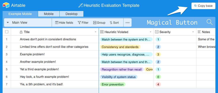
A heuristic evaluation has a few moving parts: A title, a description, a severity rating, a recommendation, and documentation of the issue, usually via screenshot and location. You can set up your Airtable’s fields to accommodate this, but I already have a table set up just for you. To use this as a template, hit the magical "Copy Base" button on the top right.

This template uses the basic 10 heuristics originally defined by Nielsen in the 1990s. You should add or remove rules based off your individual work and priorities—only you can know the exact rules your product should obey.
2. Set up your environment:
Optimally, you’ll have a few things with you. First, a version of your ruleset which you can reference—print it out or bring it up on another monitor. Next, the device on which you will be testing. Finally, a computer for annotation.
3. Begin testing:
Walk through your product or website in mind-numbing detail. Push every button and click every link. Fill out the forms. Prioritize the paths you know your users take. If you don't know which paths your users would take, you should take a few steps back and reassess where you are.
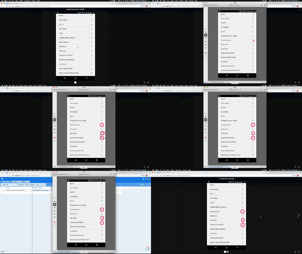
When you find an issue, write a description and assign it a severity (For more information on assigning a severity, Nielsen comes to the rescue with a detailed explanation.) Screenshot it on your testing device, and attach the screenshot to the record. Instead of trying to find a way to annotate it on the phone, I tend to pull it down to my computer and dash off some annotations with Skitch. If you’re on Windows, your best bet might be Snagit or maybe even Greenshot.

4. Do something with it:
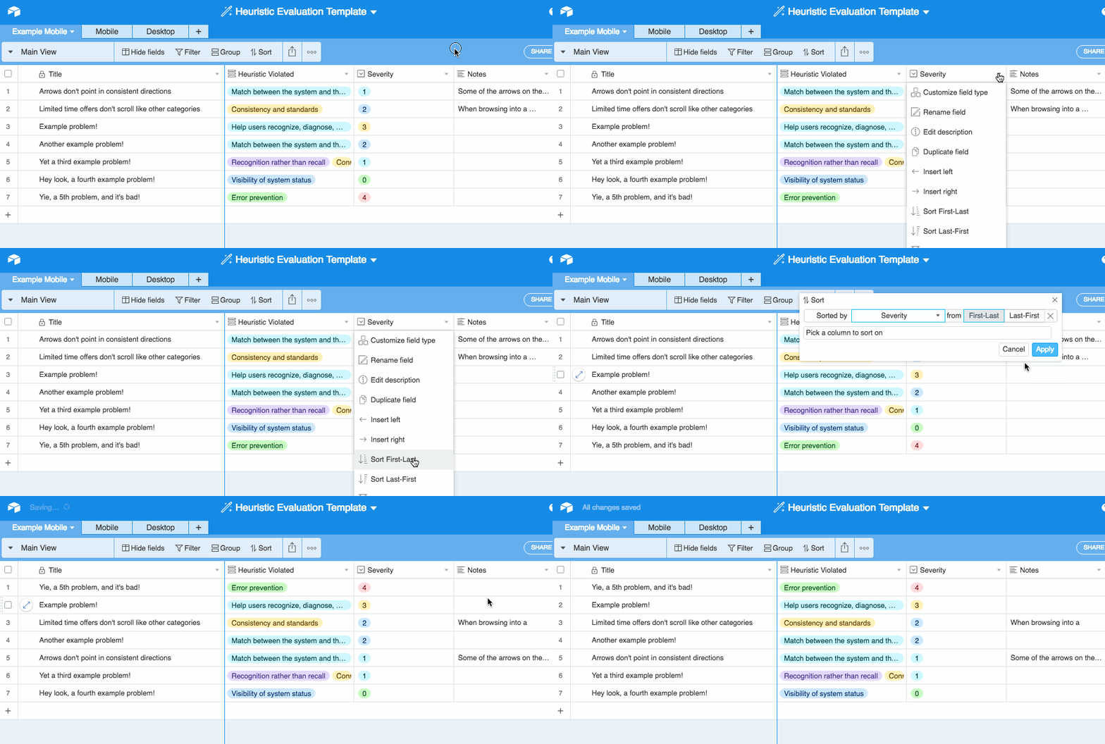
A heuristic evaluation is only useful if you do something with the results. Your end goal is not just finding problems, but prioritizing fixes. One of the major benefits of Airtable is you can sort and filter based off problem type or severity. Which problems did you rate the worst? How frequently did the system break a specific rule?
Sort by severity

Filter by heuristic

Airtable keeps a detailed log of everything that happens to a record, so you can even add in a checkbox to indicate if it’s been resolved. Using an integration service like Zapier, you can also hook Airtable up to an external task management system, like Trello or Asana.
A heuristic evaluation isn’t a replacement for user testing. Use heuristic evaluations to establish the landscape of an upcoming project, or as quality assurance during development. It’s a good way to test the pulse of the project, checking if you’re on the right track and nailing down tricky details. Heuristic evaluations provide a valuable perspective and a good structure for reviewing your work.